HOLA SVG, a Handy SVG Tool
When to Use SVG
In real projects, we frequently need icons for user actions, such as arrows and next/previous controls. SVG is great for this: the shapes are simple, and it is easy to tweak color and size.
HOLA SVG
I want to share a useful website: HOLA SVG.
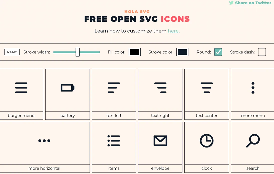
I first used it in late 2020. When I came back in 2021, the icon library had grown a lot.
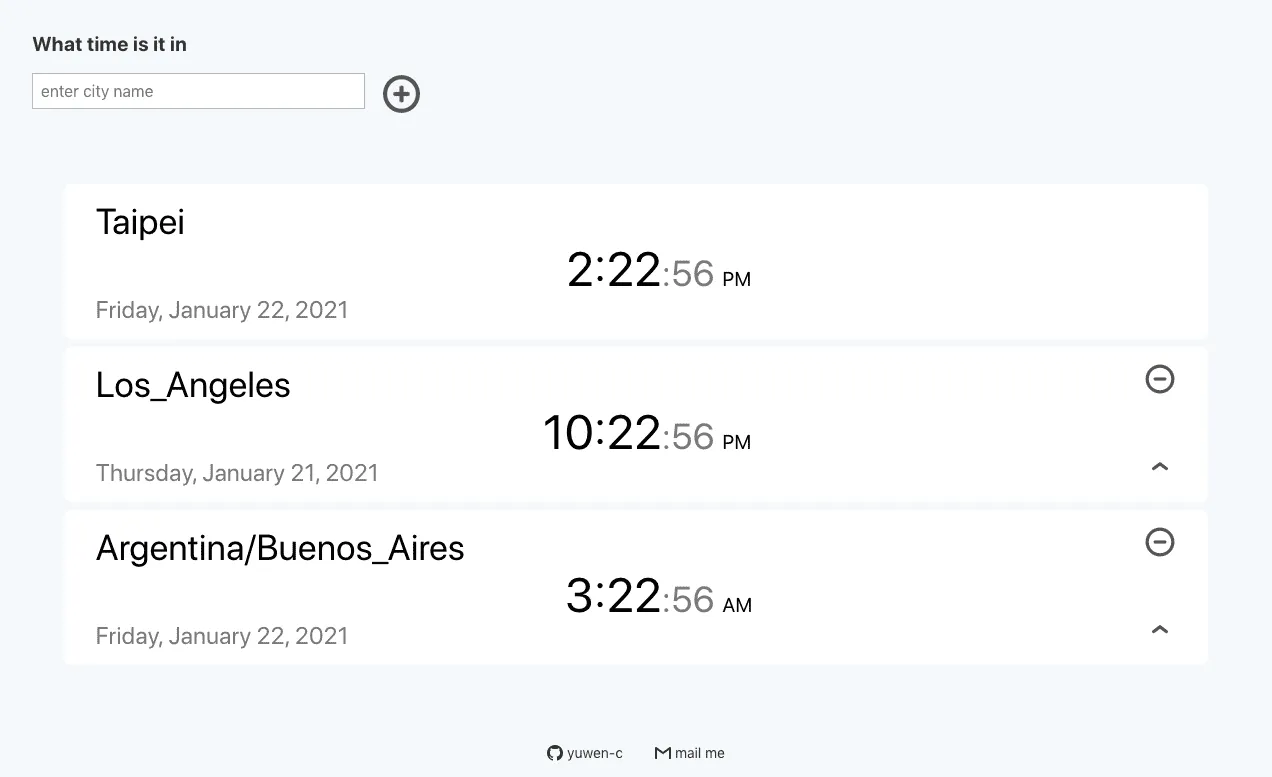
I used several icons in my worldtime project: a plus icon, a minus icon, and an upward symbol.
Take the plus icon as an example:
<svg fill='none' stroke='#0E1A27' stroke-width='8' stroke-dashoffset='0' stroke-dasharray='0' stroke-linecap='round' stroke-linejoin='round' xmlns='http://www.w3.org/2000/svg' viewBox='0 0 100 100'>
	<circle cx="50" cy="50" r="40"/>
	<line x1="35" y1="50" x2="65" y2="50" />
	<line x1="50" y1="35" x2="50" y2="65" />
</svg>
Its structure is straightforward: an outer svg tag with one <circle> and two <line> elements.
Here is how I used it in my project:
<div className="w-10 ml3">
	<svg className="grow"
  fill='none' stroke='#555555' strokeWidth='10' strokeDashoffset='194' strokeDasharray='0' strokeLinecap='round' strokeLinejoin='round' xmlns='http://www.w3.org/2000/svg' viewBox='0 0 100 100'
  onClick={onPlusButton} >
	<circle cx="50" cy="50" r="40"/>
	<line x1="35" y1="50" x2="65" y2="50" />
	<line x1="50" y1="35" x2="50" y2="65" />
</svg>
</div>
P.S. Since I used React, I changed SVG attributes to camelCase.
stroke-width='8'

strokeWidth='10'
Easy Customization
Because the code is simple, customization is easy. You can change colors with stroke and thickness with stroke-width.
The website also has a top control bar where you can adjust width, color, and corner style.

For icon size, wrapping with a <div> works well. In my example, w-10, ml3, and grow are classes from Tachyons.
You can also modify icon geometry directly. I needed an “up” action icon, so I started from a startup symbol:
<svg fill='none' stroke='#0E1A27' stroke-width='8' stroke-dashoffset='0' stroke-dasharray='0' stroke-linecap='round' stroke-linejoin='round' xmlns='http://www.w3.org/2000/svg' viewBox='0 0 100 100'>
	<line x1="20" y1="80" x2="80" y2="80" />
	<line x1="50" y1="15" x2="50" y2="65" />
	<polyline fill="none" points="30,30 50,15 70,30" />
</svg>
It is composed of one <polyline>, one vertical line, and one horizontal line.
I wanted a simpler shape, so I removed both lines and kept only the upward stroke:
<div className="w-10 dib fr w2-ns">
	<svg
	 onClick={() => {onUpButton(tz)}}
	 className="grow"
	 fill='none' stroke='#555555' strokeWidth='10' strokeDashoffset='194' strokeDasharray='0' strokeLinecap='round' strokeLinejoin='round' xmlns='http://www.w3.org/2000/svg' viewBox='0 0 100 100'>
	<polyline fill="none" points="30,30 50,15 70,30" />
	</svg>
</div>
Other Resources
Another good SVG source is Font Awesome. It has many practical icons, though setup requires package installation.
If you only need a small number of simple functional icons, HOLA SVG is a great choice. The creator, Mariana Beldi, is an Argentinian graphic designer and UI/UX engineer.